When it comes to books of any stripe—fiction, nonfiction, or even a planner—nothing screams amateur louder than bad formatting.
The truth is, book formatting mistakes can ruin even the most brilliant writing. Margins tighter than the Levi’s you wore in high school, teeny typography that requires a magnifying glass to read, novelty fonts that shouldn’t be seen outside of a preschool setting (looking at you Comic Sans).
Just because your book is DIY, doesn’t mean it doesn’t need to look professionally published.
As a former art director with a design degree and hundreds of book layouts behind me, I’ve seen the same 5 book formatting mistakes ruin great books over and over.
(And I’ve definitely made more than a few myself.)
In this video, I’ll show you exactly what those mistakes are and how to fix them—so your book looks clean, credible, and totally professional.
And at the end I’ll share the tools I personally recommend for designing your books like a pro.
Watch it here:
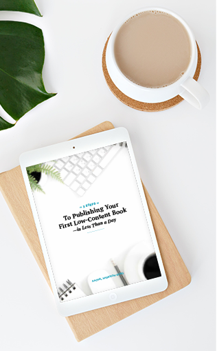
Want to learn how to start generating passive income with simple, easy to create books like prompt journals, workbooks, daily planners, and more? Download my free guide: 3 Steps to Publishing Your First Low-Content Book In Less Than a Day